
Welcome to our redesigned site! We hope you enjoy the refreshed look and content.
As we work toward reopening for meetings and events, we will add photos, diagrams and information for the benefit of our meeting planners, attendees and exhibitors. We expect to expand and enhance our Safe Meetings pages as we receive further guidance from the State of California and continue preparing to reopen with the safest, cleanest and most welcoming environment for our guests.
To provide context for the overall redesign and share more about the project’s goals, strategies and more recent pandemic-related considerations, I posed the following questions to Geri Koenig, our talented visual and user experience designer. She has served as the design lead, project manager and passionate advocate for our website’s audiences.
Why did the team decide to redesign the website?
The website was redesigned several years ago but it wasn’t rooted in research. The design was based on assumptions about our users over the years, and it was time to challenge those assumptions to create an experience that aligned with our users’ wants and needs.
I led the organization through a user-centered design process to create a website that is useful, accessible and consistent. It was a group effort—everyone on the Communications team participated in running research, writing content, critiquing design and delivering the final product. In addition, we relied heavily on our cross-functional staff to provide expert insight into our customers and the industry.
How did the research inform the design?
We conducted several forms of qualitative and quantitative research. We facilitated interviews with various users, including our own staff. To gather broader input, I created an online survey asking users to identify their user type and task. I know some say that no one takes surveys but we had an impressive response!
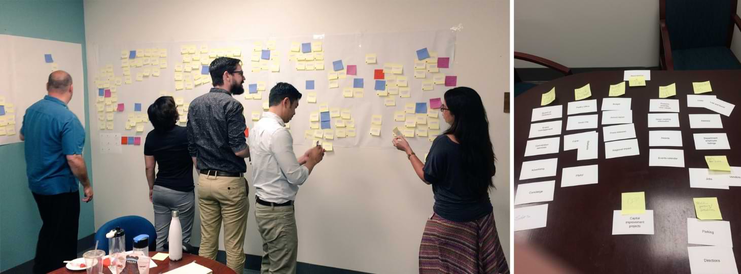
I evaluated our website’s analytics and researched our competitors to understand user expectations. We worked with internal teams to understand industry terminology and how to group our site’s architecture in a way that would make sense to our various audiences. To bring it all together, the team spent two days in a workshop, organizing the data into distinct groups. Finally, we developed personas to create a realistic representation of our most important user types.
Is there a specific section or detail about the website that you personally enjoy?
For one, I am so proud to have an accessible website. We designed this site to meet Level AA Web Content Accessibility Guidelines. It was a team effort because everything had to be carefully considered, including visual design, copywriting, video and development. I truly believe it makes the experience better for everyone.
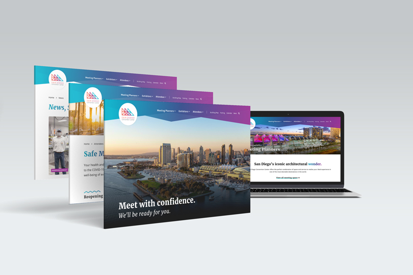
I also sought to make the News section a more modern story-telling experience. The new design emphasizes style, readability and large-scale photography in News posts (like the one you’re reading now). It allows our writers to add their own creative touch to their stories.
Where did you find inspiration for the design?
The Convention Center already has a strong brand thanks to our brand manager, Hailey Adams. I took our existing brand standards and applied them to the digital experience. While considering possibilities, I researched direct and indirect competitors, including other venues, hotels, tourism authorities and travel planning websites.
I was also inspired by our own staff’s commitment to customer service. We have the best team in the industry when it comes to sales, event management, guest services, security – you name it. I wanted that to translate into a helpful, customer-focused website.
It’s important to me that users get a consistent end-to-end experience with the Convention Center, from their initial website visit, to the first time they step inside our lobby, to their last session in one of our meeting rooms. I envisioned a seamless brand experience at every touchpoint.
How did the concept evolve over the course of the pandemic?
Our website has always prioritized education and transparency, and the pandemic made those priorities even more critical. Currently our primary goal is to deliver clear and consistent messaging regarding event changes, reopening and safety measures. Our audiences want the most complete and up-to-date information.
Moving forward, we want to make sure our photography speaks to new social distancing and sanitization protocols. We want our meeting planners, attendees and exhibitors to be at ease knowing they are coming to a safe venue. We will continue to research, observe and listen to our users to make sure we are providing a relevant, useful and exciting digital experience.